
Iconography
In general, icons are visual symbols that represent ideas, objects, or actions. USANA Studio's leads the creation, iteration, and updating of all icons and icon styles. For any custom iconography work, please first look at Font Awesome to see what icons can be found there.
With lots of negative space and big rounded corners, we have designed USANA's iconography to be simple, engaging, and clear. We're currently using filled icons since they tend to communicate more clarity and importance. Filled icons, like bold fonts, are generally bolder and have a greater tendency to catch a user's eye.
Types
Accessibility
Action
.svg)
.svg)
Audio
Communication
Content
Device
Editor
Image
Navigation
Notification
Social
Toggle
Video
Emoji
USANA Brands
Body Benefits
.svg)
Other Brands
Social Media
Payment
Guidelines
Layout
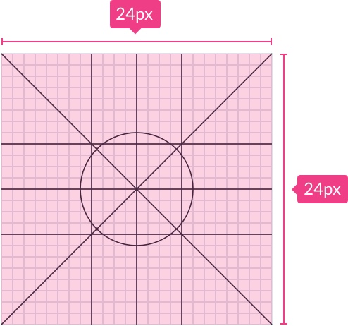
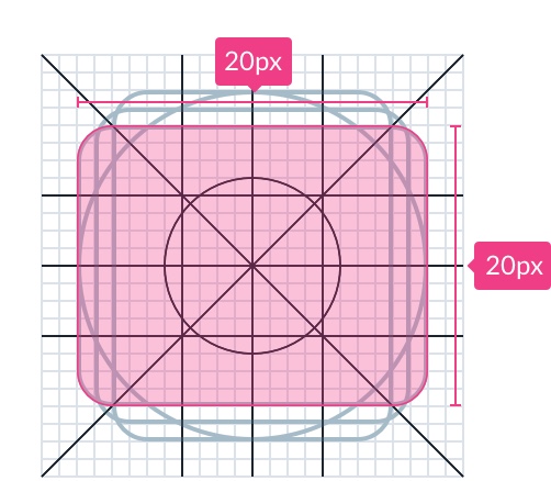
By default, icons are displayed on a 24px x 24px pixel grid. The icons should be centered horizontally and vertically on the pixel grid.
Canvas
24 x 24 px is the default size for icons and should be designed at 100% scale.
Padding
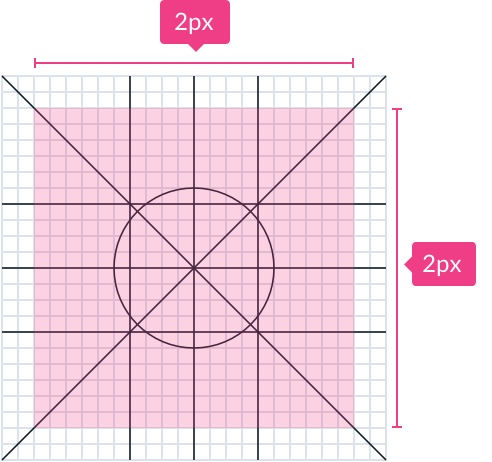
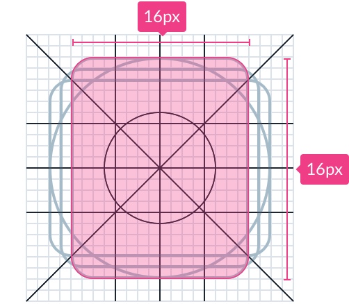
2px padding needs to surround the live area. 2px can be ignored if dealing with a brand or trademark.

Live area
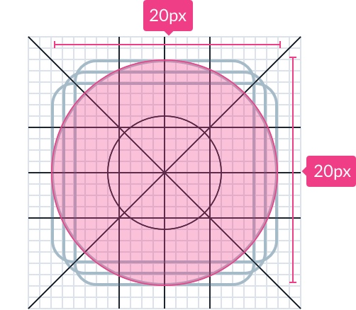
The live area is for the icon is limited to a 20px x 20px live area, with a perimeter of 2px.
Keylines
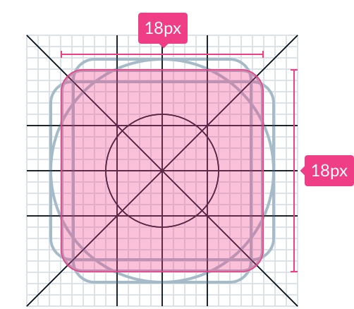
Key-lines allow shapes like circles, squares, and rectangles to be specified in terms of their size. Based on Materials key lines, they will change as USANA develops its icon library.
Circle
Square
Rectangle (vertical)
Rectangle (horizontal)
Spacing & Text Targets
Spacing
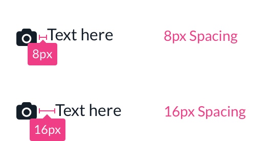
Ensure that spacing between icons and text meets the rules of 8.
Text Targets
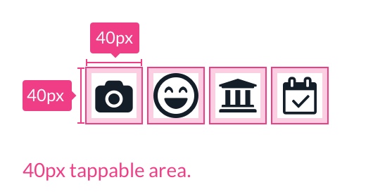
Icons need to have a tappable area of at least 40px for interactive components.
Sizes
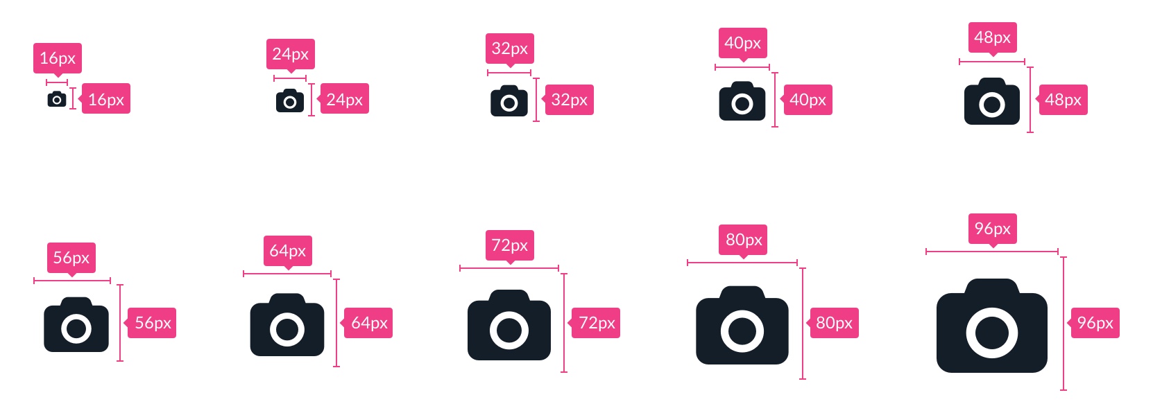
Icons are created using 24px art boards. Additionally, icons must be viewable at 16px, 48px, and 96px. Other sizes may be utilized, but they must be consistent with the design's content and layout.
- Use in a purposeful manner to maximize comprehension and reduce cognitive load when you need to call attention to a particular action, command, or section.
- In combination with meaningful text to support users progressing through the product in an accessible manner.
- To help users who have difficulties with reading and attention.
- In places where text label doesn’t fit.
- Scale icons to fit your designs. This can cause the proportions to be off-balance and can create unintended hierarchy within the experience.
- Make icons overly complicated.
- Don’t use unapproved shapes.
- Avoid when a button’s action is already clear based on a text label alone.